Design System That Cut UI Design Time by 32% and QA Feedback Cycles by 49%
Role
Full Time / Platform Designer
Platform
iOS, Android, Web
Timeline
Jul. 2022 - Sep. 2023
Tools
Figma, Protopie, Slack, Notion
Deliverables
Design System, User Interview, Prototyping
Project Overview
This design system went beyond building UI components.
I led the initiative independently, starting by aligning the organisation around why the system was needed and the problems it aimed to solve. The system includes a token-based colour foundation, layer and popup hierarchy, UX writing guidelines, and interaction principles. It was designed to deliver a consistent experience across iOS, Android, and Web, while still respecting the unique characteristics of each platform.
Impact
Design time per screen
-0%
-0%
QA feedback cycles
-0%
-0%
Component reuse rate
0%
0%

Problem
Discovered
To identify the underlying issues, I conducted interviews with designers and engineers across the organisation. During these sessions, I asked a set of questions to better understand their awareness of design systems, the challenges they had experienced without one, and what they expected from a future system.

How familiar are you with design systems?
What do you think a design system is?
What challenges or frustrations have you experienced so far?
What are your expectations for a design system?
While there was general agreement on the need for a design system, it was often perceived as simply a UI kit, and the concept itself was not clearly understood.
As a result, although there were several attempts to introduce one, it was never systematically established or sustainably maintained at an organisational level.
Key Findings
1
Lack of organisational alignment on the design system
There was no shared understanding across the organisation of why a design system was needed or the value it should provide.
2
Limited component reuse across teams
Components created by different teams were not shared or reused, leading to multiple versions of similar components being repeatedly built.
3
Inconsistency between design and development components
The components used in design and those implemented across platforms were slightly different, creating inconsistencies in the final product.
4
Absence of system-level guidelines beyond UI
Although a UI kit existed, there were no clear standards for UX writing and interaction patterns, resulting in inconsistent tone and behaviour across the product.
The Solution
Goals
Establish a clear foundation for product design by introducing a design system that enables teams to work with shared standards, reduce inefficiencies, and deliver a consistent experience across platforms.
Key Objectives
1
Establish a Shared Design Foundation
Define a clear foundation for product design and establish a design system that enables everyone to approach the product with a shared understanding and consistent standards.
2
Enable Consistent Product Design
Provide components, UX writing, interaction, and behavior guidelines so designers can work consistently as if the product were designed by a single person.
3
Improve Team Efficiency
Reduce repetitive work, communication overhead, and QA rework so teams can focus more on product experimentation and validation.
Design Process

Define Principles
Aligning Teams Around Shared Product Values
I conducted a workshop to explore and define these topics.
What philosophy guides how we design and build the product?
What tone and voice should we use when communicating with our users (personas)?
What are the core brand values our product aims to convey?
As a result, the following key themes emerged, which informed the direction of the design system.
Design Tone & Manner : Clean, Lively, Comforttable
Design Principles : Refine & Clear, Various & Lively, Easy & Comfortable

Based on the workshop outcomes, I held a company-wide session to share the design system’s vision, current challenges, implementation of foundations and components, and how success would be measured.
As a result, qualitative interviews showed that awareness of the design system increased from 31% to 92%
Design
Foundation
Token color palette
The color system was developed in collaboration with the BX team to enable consistent color usage across both online and offline touchpoints. To ensure readability and accessibility, primary colors were tested for contrast in accordance with WCAG standards. Based on this, a color token system was established by assigning colors according to their intended purpose, resolving issues caused by multiple colors being used for the same function.
Main/700
#00A5AA
rgb(0, 165, 170)
hsl(182, 100, 33)
Text/mint-primary
Background/mint-primary

Typography
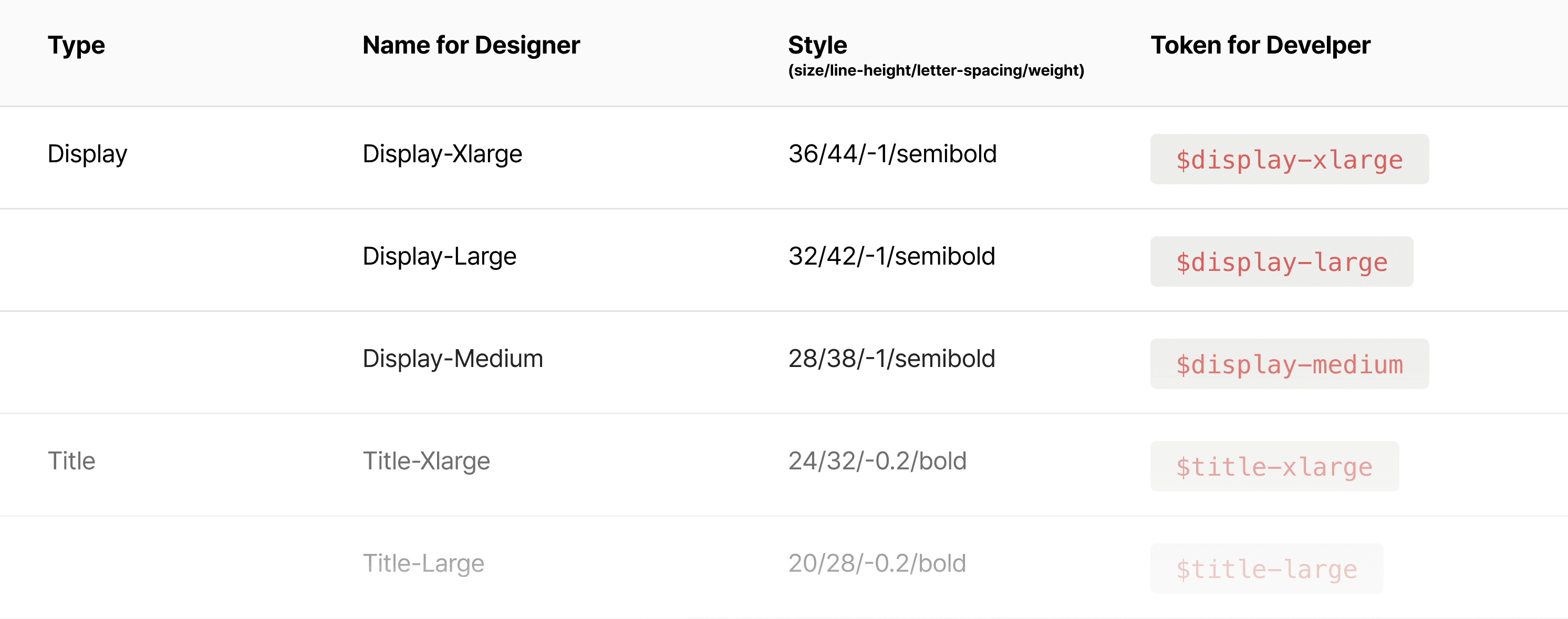
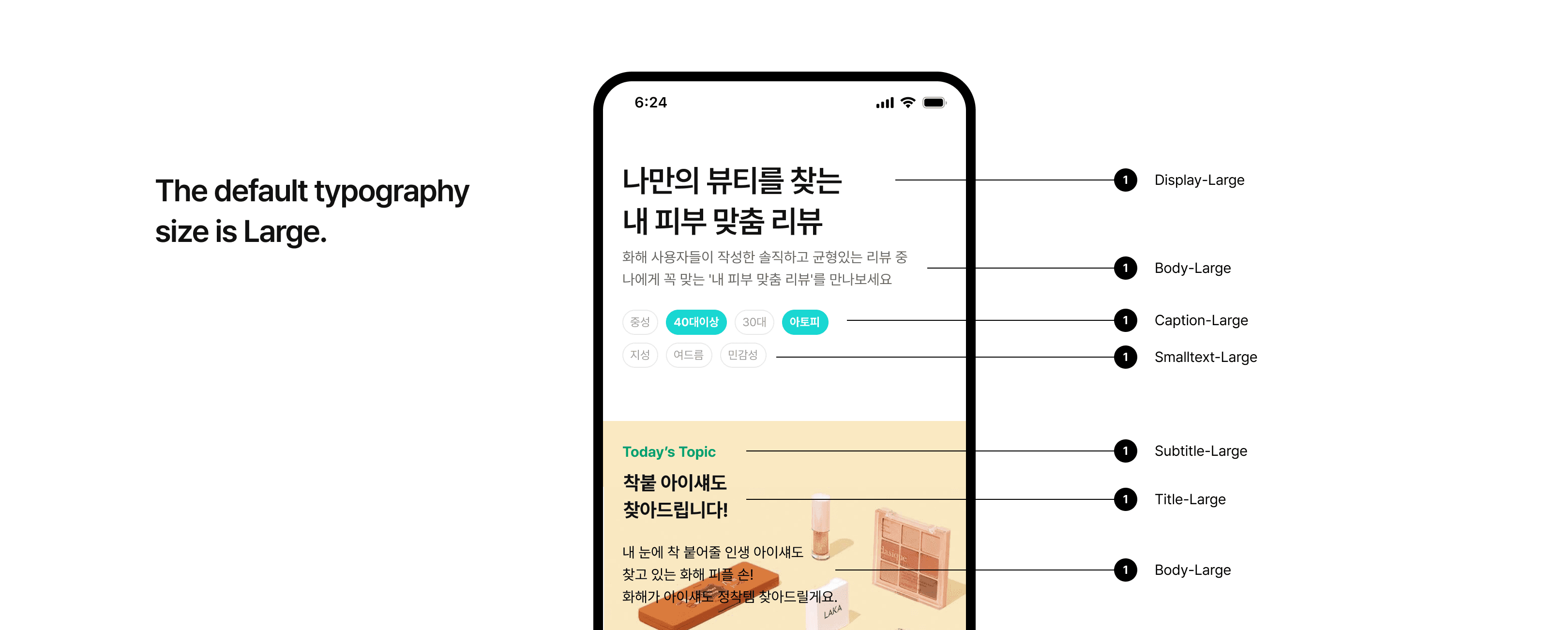
We standardized typography style names so that designers and developers use the same terminology, and provided clear usage examples for both sides. The examples include guidelines to ensure text alignment is not arbitrarily changed in both single-line and multi-line use cases.
Given the large scale of the service, we defined a wide range of text sizes and included appropriate usage examples for each. Since typography styles are defined for various use cases, the system is designed to allow tracking of usage frequency, making it possible to consolidate or replace rarely used styles in the future.
Icon
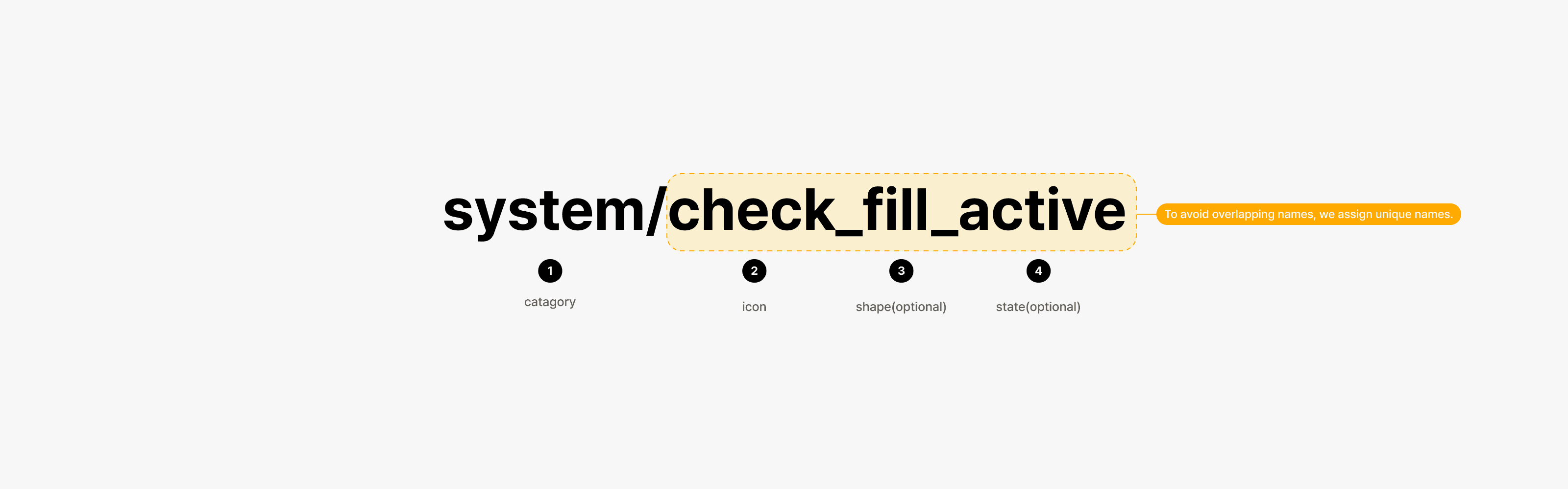
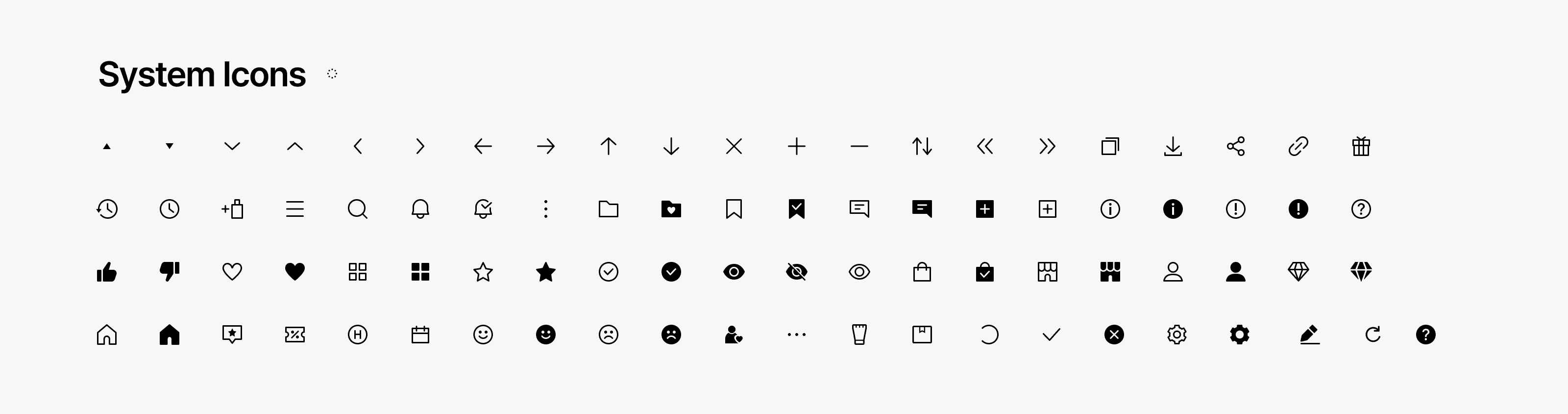
Icons are organised by category, name, shape (border or filled), and state to ensure consistent naming. Each icon is built as a single vector shape to maintain a clean and minimal structure.
Radius
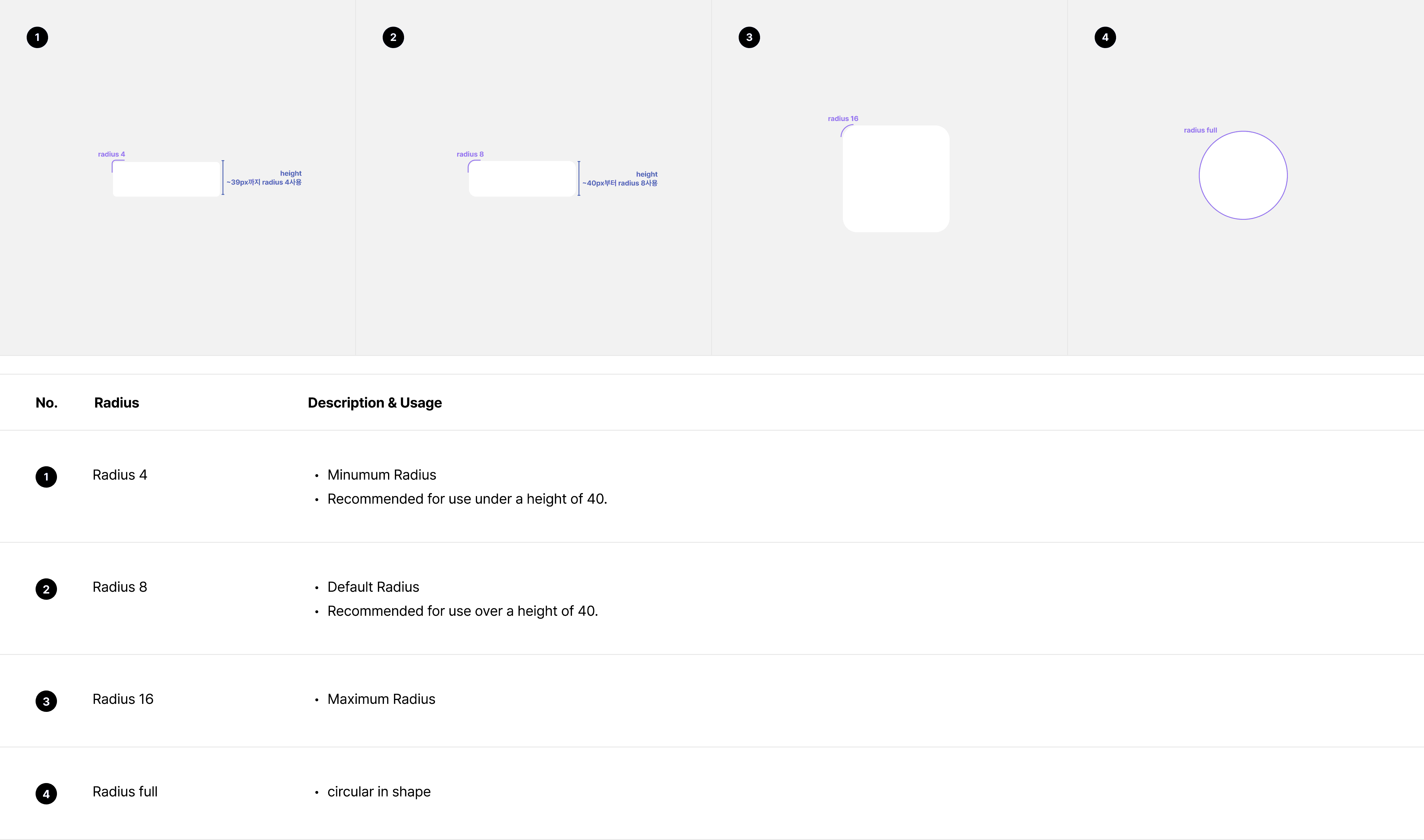
To create a lively visual experience, we use radius as a design element and provide clear guidelines to ensure it is applied in a balanced way - neither excessive nor insufficient.
Shadow
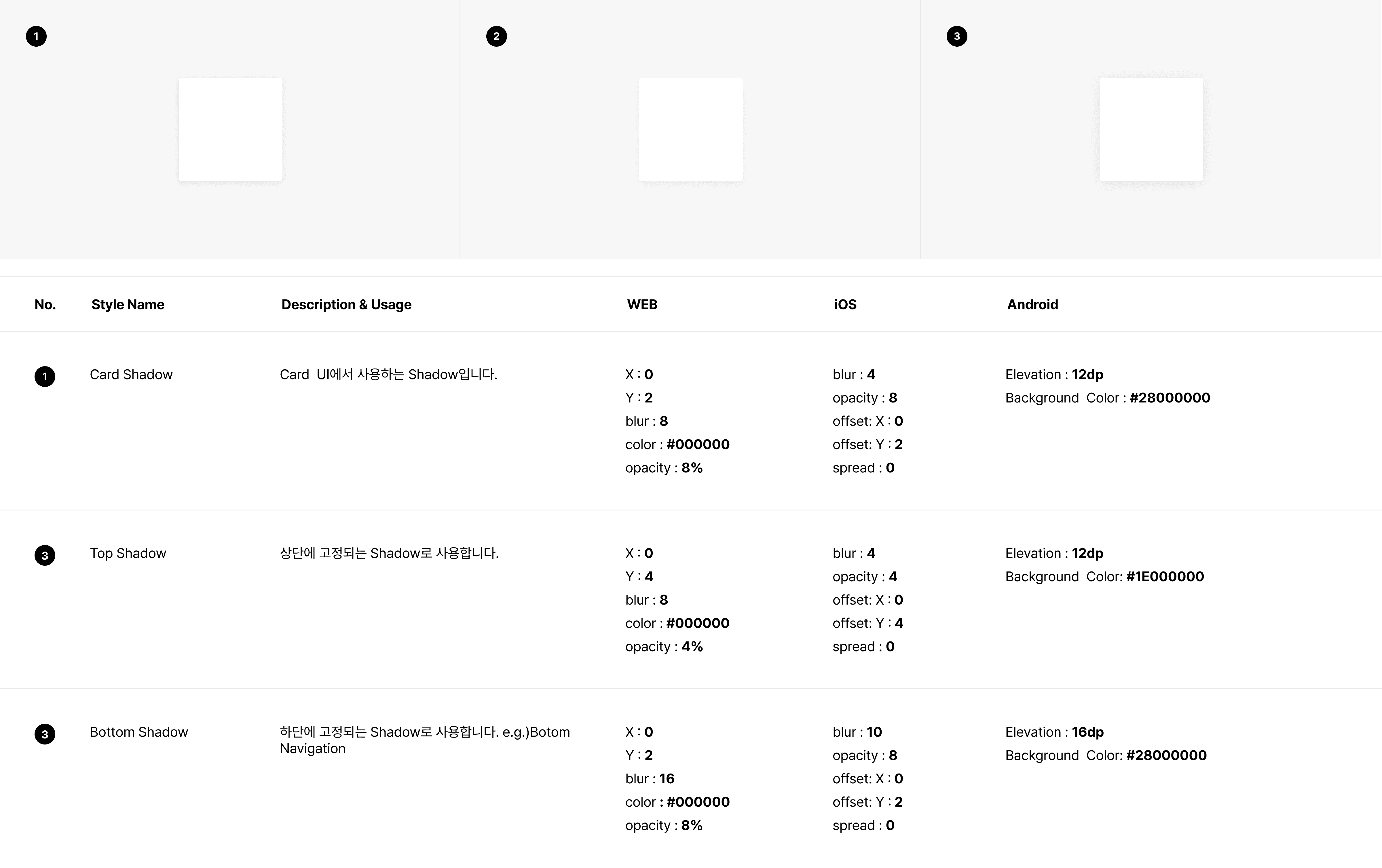
To maintain a clean appearance, we avoid using excessive shadows.
Shadows are adjusted to ensure the final result delivers a consistent visual impression across platforms.
Componenet
System
Template
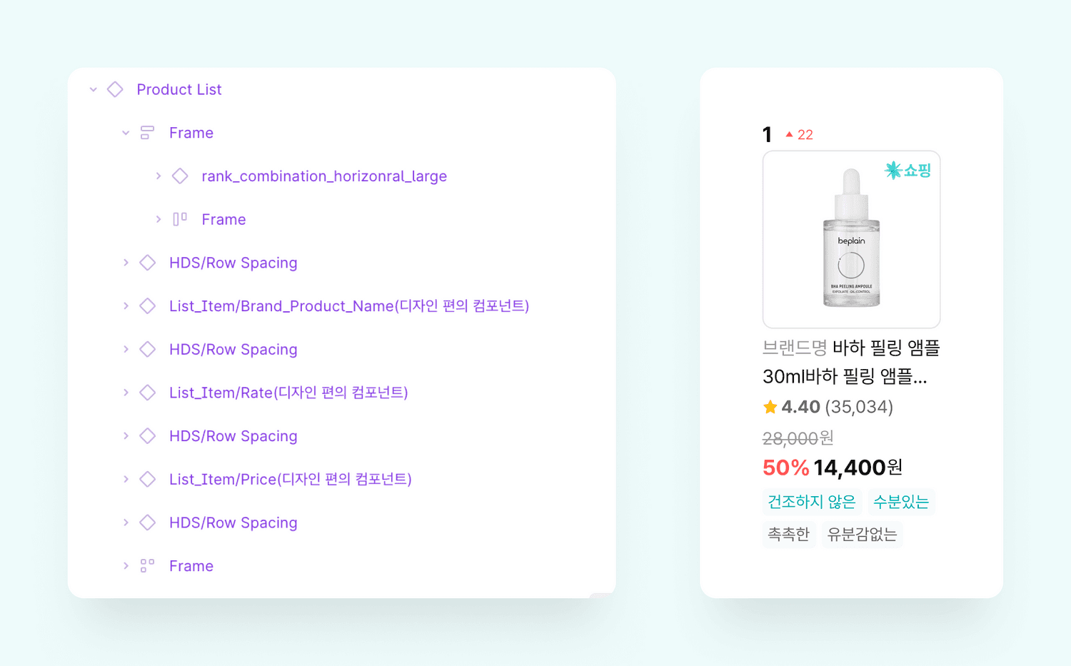
The Template is built as a modular component and is designed to be easily modified or extended using variants. It is used across various pages, and each team can adapt it according to their specific goals. For example, it can be configured to highlight pricing, focus on ingredient information, or indicate whether the product is available for purchase within the Hwahae platform.
Guideline & Documentation
Interaction
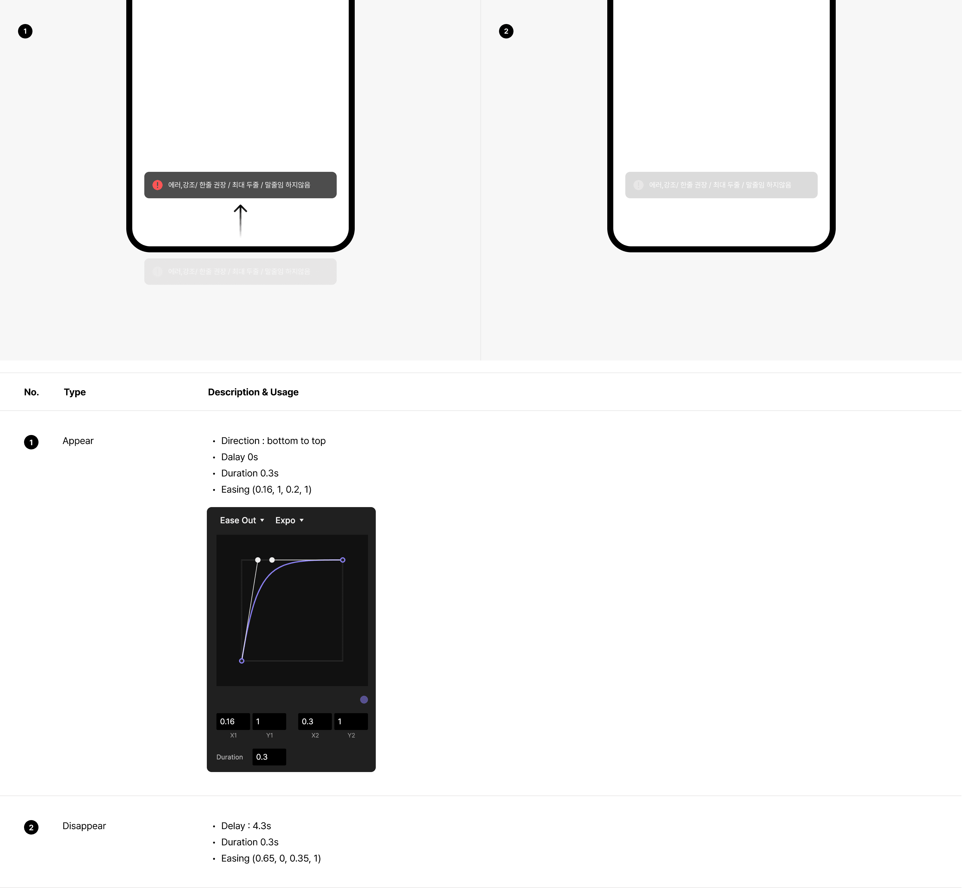
To ensure a consistent experience across all platforms, we defined appear and disappear interaction guidelines, enabling uniform behavior regardless of platform. This approach delivers usability aligned with the brand definition.
Behavior
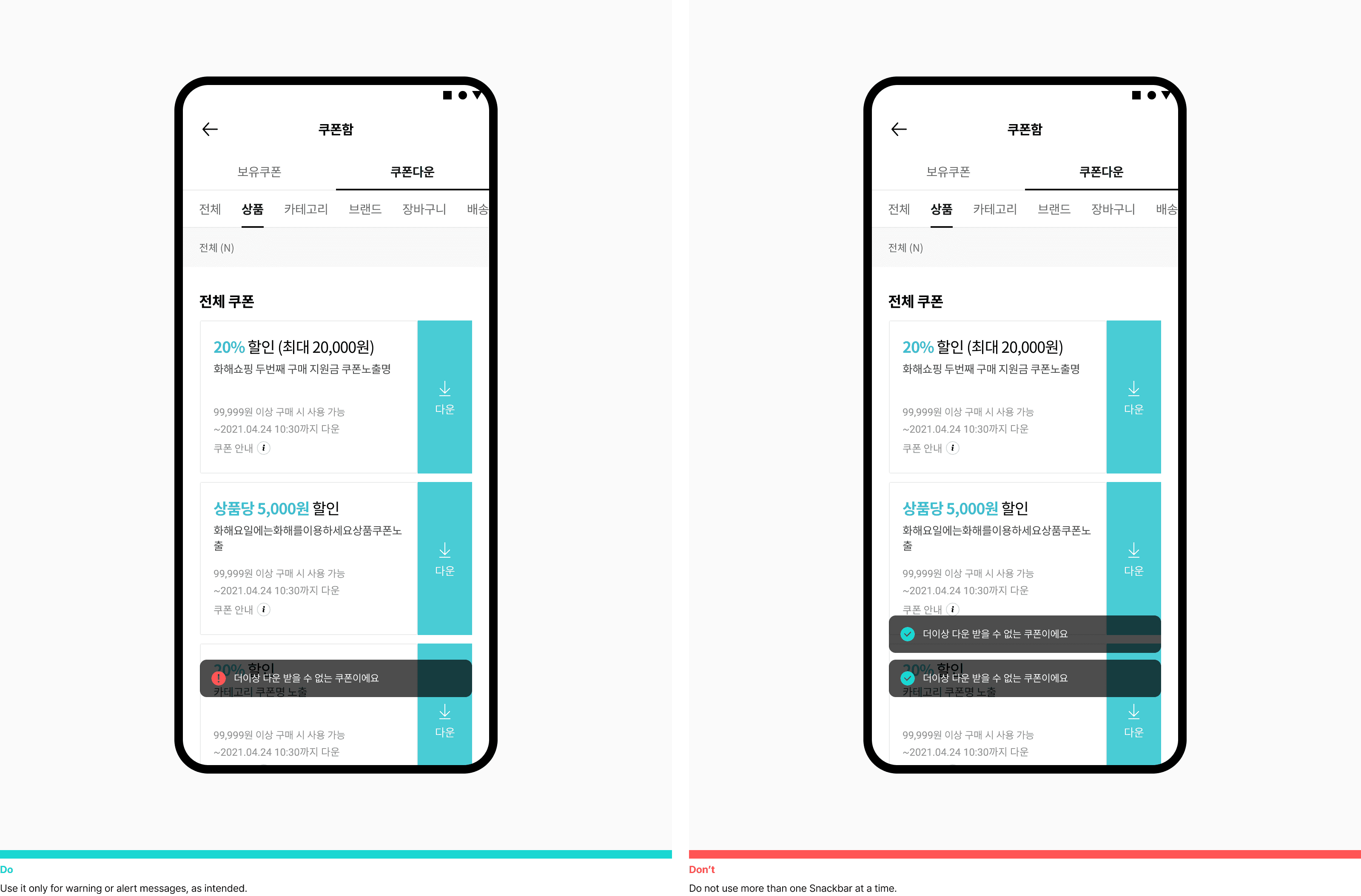
Behavior guidelines were added to all components, clarifying interaction patterns and state changes. This reduced ambiguity between design and development, improved implementation consistency, and strengthened the scalability and reusability of the design system.
UX Writing
UX writing guidelines were defined to reflect the intended product tone and to clearly communicate errors, warnings, suggestions, and informational messages, helping users understand context and take appropriate next actions.

Layer Priority Guideline
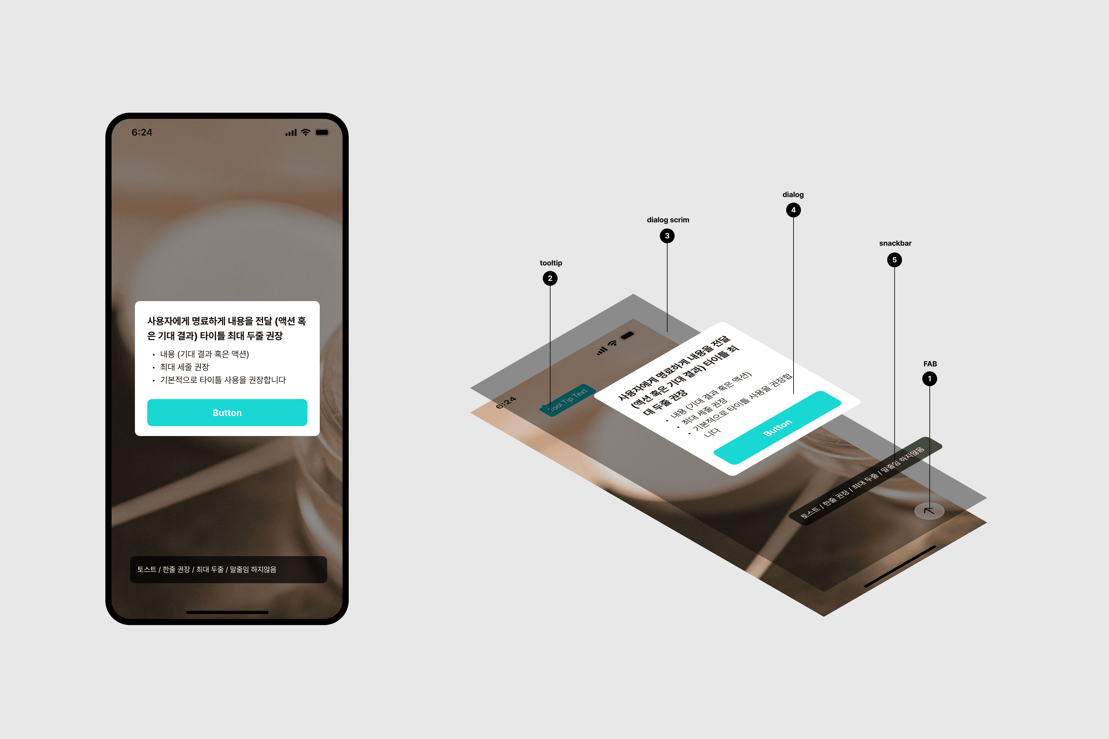
When multiple situations occur on a single screen, layer priority guidelines were defined to ensure that the most critical information is presented first, reducing visual confusion and supporting clear user decision-making.
Implement & Adoption
1
스토리북으로 관리
There was no shared understanding across the organisation of why a design system was needed or the value it should provide.
2
Limited component reuse across teams
Components created by different teams were not shared or reused, leading to multiple versions of similar components being repeatedly built.
3
Inconsistency between design and development components
The components used in design and those implemented across platforms were slightly different, creating inconsistencies in the final product.
4
Absence of system-level guidelines beyond UI
Although a UI kit existed, there were no clear standards for UX writing and interaction patterns, resulting in inconsistent tone and behaviour across the product.
+0
+0
Variants
-0%
-0%
Design time per screen
-0%
-0%
QA feedback cycles
0%
0%
Component reuse rate
Impact & Metrics
+0
+0
Variants
-0%
-0%
Design time per screen
-0%
-0%
QA feedback cycles
0%
0%
Component reuse rate
Impact & Metrics
Components are now organized in one design system, so it’s easy to find and reuse what other teams have built.
Product designer
I can spend more time thinking about UX instead of rebuilding UI. More templates would be great.
Product designer
Using the same components for the same features reduced inconsistencies and made the experience more consistent.
iOS developer
Design and development are much better aligned, so it’s clear which version is correct and QA is easier.
QA engineer
UX writing guidelines help me use a consistent tone without overthinking each message.
Product designer
Clear interaction rules between iOS and Android removed confusion around platform differences.
QA engineer
The system feels closer to our brand direction, and teams now speak with one voice.
Brand designer
App and web components are aligned, reducing gaps and making maintenance easier.
Front End developer
Metric
+0
+0
Variants
-0%
-0%
Design time per screen
-0%
-0%
QA feedback cycles
0%
0%
Component reuse rate
Other Projects